Opportunity is Often Missed

Whilst recently reading Neil Oliver’s book, “Wisdom of the Ancients”, one of the quotations that particularly stood out to me was about how “opportunity is often missed, as it comes wearing overalls and involves hard work.” It immediately made me think about the old Russian propaganda posters showing strong men and women, working for the good of the Communist state. The sentiment struck a particular chord with me, reminding me of the very first lecture of my art course at university (The College of Ripon and York St John) where we were told by Keith Martin (bless him), in no uncertain terms, that there would be no time for ‘artistic temperament’ and that we would be expected to come in every day and work hard – art is hard work! Whether it was because of that, or because of the work ethic instilled in me by my parents, I have always believed that if you want to achieve anything, in any field, talent alone is not enough – hard work is also a necessity.

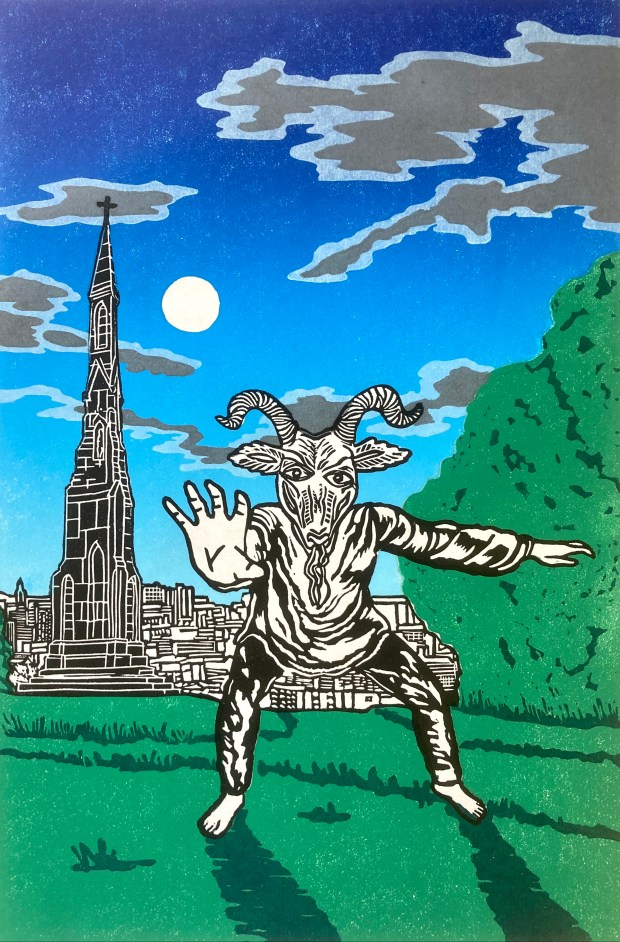
I am very pleased with the way this print has come out – I like the strength and energy.

Spring Heeled Jack – Again

I was never 100% happy with the original version of my Spring Heeled Jack print, mainly with the head and face – it just didn’t look as I’d imagined it. After a number of variations, I settled on the one shown here, using the goat-head often seen in folklore. I also decided to make a feature of the background, bringing the Victorian legend up-to-date by showing the modern-day Sheffield skyline behind the iconic shape of the Cholera Monument. It was done as a two block reduction print and whilst it’s not technically perfect, I’m pretty happy with the overall atmosphere.

Let’s Dance

More as a diversion than anything else, I decided to redraw and cut a lino print of the logo I have used for many years for my ‘Short Supply’ musical output. I did use it on the label for the one and only 7″ single I put out in the early 1990s, called “The Day The Earth Stood Still”. We (Justin – the vocalist and myself) recorded it in Rotherham at The Powder Room studios. It features cut ups from the film of the same name and a killer chorus – haha!

Mermaid

This image started life as a drawing of an Asrai – a sea creature with webbed feet and hands, that is occasionally but rarely seen by man. However, half-way through the designing process, I decided to change it to a mermaid as this is an image more people would be familiar with. The design is printed using Traditional Gold Ink on blue, Japanese Washi Paper.

A Stranger Came Ashore

In my previous life as a Primary School teacher, I always put great value on the reading of stories to the whole class and would choose them carefully. One story on which I took a risk was, “A Stranger Came Ashore” by Mollie Hunter. It was a risk because it isn’t funny, it isn’t in the modern day and it is set in the Shetlands – an environment totally alien to the children I taught; the school is in the middle of a tough, inner-city housing estate. However, the story is so beautifully written that it is able to transport the children into another world and it was the only story I haver ever read, in over thirty years of teaching, where the class involuntarily clapped the ending, smiles all over their faces.

I have decided to take various sections of the story and try to represent them in print. To me, the themes of Old Magick and the supernatural, are very much in keeping with the majority of my artistic output. This first image is of the small, fictional village of Blackness where the story begins and where it is mostly set.

Avebury Magic

For some time now, I have been wanting to make a print of the magical stones to be found at the World Heritage Site of Avebury – one of the biggest stone circles in Europe. Having tried (and failed miserably) to do a collagraph print, I settled back on a lino cut. However, this time I used sponges rather than rollers to apply the inks to give it more of a textured finish. Whilst there are undoubtedly some flaws evident, I am generally very pleased with the finished result; there is a very graphic quality to the image but that reflects my drawing style, which has always ended up with quite well-defined, thick lines, even when I try not to!

Minster Man

For the November round of the “One of Many Postcard” initiative, I decided to take the image of the Green Man that can be seen carved at the top of one of the columns inside Rotherham Minster. The original carving has the traditional vines issuing from the mouth but I wanted to isolate (and flatten) the face. The postcard version was slightly cropped to fit the card size, but here is the full, uncropped version. The background was made using sponges rather than a roller.